| Welcome Guest ( Log In | Register ) | Resend Validation Email |

| 6 Pages:12345>»» ( Go to first unread post ) |    |
| DrTim |
Posted: December 06, 2007 10:14 pm
|
 Double Chevron  Group: Members Posts: 538 Member No.: 715 Joined: March 27, 2007 |
hopefully andmcit can be persuaded to have a go at the 2nd iteration now ...
-------------------- XM 2.0i Prestiege (Red) 1992 K reg RP 5692 (deceased)
XM 2.0i Turbo Ct VSX (blue) 1996 R Reg RP CJ 7135 |
 

|


| Andmcit |
Posted: December 07, 2007 01:23 am
|
 Andre's Mate Group: Members Posts: 2086 Member No.: 7 Joined: August 15, 2003 |
Hi!
I'm here, though only just, flaky broadband connection permitting... APOLOGIES FOR NOT FOLLOWING UP WITH THE ADDITIONAL IDEAS AS I THREATENED IN MY LAST POST!! My situation has been a tad grim this past fortnight and life's been VERY 'trying'. Anyhow, it's been interesting to see everyone's reactions to my initial thoughts!  What I'd started formulating the other day was a two for the price of one version before events overtook me and this has been siting on the chocks for a while:  The idea of this one is two halves that stand together as one OR split into two for say, a side window and back tailgate. The split could be make painlessly with scissors between the left Xm front 3/4's view and the Club Xm title to the right. I actually see the sticker being a white base with just one colour, in black print, with a positive application (back adhesive) rather than a vinyl against-the-glass-from-the-inside variety, very much in the 'Citroen prefers Total' in general execution. I'll get the new interpretations to as many people's thoughts on the fist one pictured asap, so watch this space!! BTW. The 'fans of funny handbrakes', in case folk thought I was losing grip on things, was a bid to gently 'send up' the stuffy/boring perception of most clubs that even HAVE funny HANDSHAKES with a dry wit and a less serious tagline to help overcome any reluctance to 'join' and raise a chuckle - it reads literally too!!   The very fact that Xm's appeal to such a diverse fan base see's a whole range of ages/ occupations/driver's varying from total 100% keen DIY'ers to love it but don't want to touch it enthusiasts; this makes a one size fit's all sticker all the more challenging a task. Therein lies the eternal bugbear - you can't accommodate EVERY crieteria/request from EVERY suggestion/comment/opinion and those that try end up with the equivalent result of a clinic tested to utter safe blandness design... I do feel, that with such a diverse range of personalities on 'show' here on this forum, it could fairly be described as quirks, very much as the car is regularly tagged. Maybe it's me, but I DO find the forums addictive too!! All the best, Andrew This post has been edited by Andmcit on December 07, 2007 07:11 pm |
|
|
| Andmcit |
Posted: December 07, 2007 01:30 am
|
|
Andre's Mate Group: Members Posts: 2086 Member No.: 7 Joined: August 15, 2003 |
 |
|
|
| xmexclusive |
Posted: December 07, 2007 10:45 am
|
|
Andre's Mate Group: Members Posts: 2877 Member No.: 144 Joined: April 06, 2005 |
Hi Andrew and All
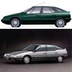
I think the latest proposal is great except that the second XM picture must be a Mk1 and not another Mk2. Regards John -------------------- An interest in 2.5TD's.
Location: Hampshire, U.K. |
|
|
| dean |
Posted: December 07, 2007 04:30 pm
|
 Andre's Mate Group: Members Posts: 1441 Member No.: 852 Joined: May 23, 2007 |
Hi Andrew
Very good idea this 2 for 1 thing, you can use whichever you prefer or both, I'm with xmexc though and would like a picture of each (mk1 and 2) and of course the use of just black and white will keep cost down and give the sticker a not too fussy look. As you have said you are never going to come up with a design to please everyone, but i think you may have got as close as possible with this one. -------------------- 92 xm 20i prestige auto (modified)R.P 5678
96 Xantia Activa (modified) location-Isle of wight |
|
|
| Andmcit |
Posted: December 08, 2007 02:47 pm
|
|
Andre's Mate Group: Members Posts: 2086 Member No.: 7 Joined: August 15, 2003 |
Probably better for it too - the s1 side profile view IS more distinctive at this proportion/area
THOUGH THE REAR 3/4'S KINK HIP IS MERGED INTO THE PROFILE MORE. I'll see about finding other pics if possible.  Andrew |
|
|
| Andmcit |
Posted: December 08, 2007 02:51 pm
|
|
Andre's Mate Group: Members Posts: 2086 Member No.: 7 Joined: August 15, 2003 |
...and possibly with the effect of just to confusing things:
  It DOES all hinge on how good an image I can source as the hip and the front scuttle are the key design elements that you can pull out in a cropped picture in a more abstract manner... Andrew |
|
|
| Ciaran |
Posted: December 08, 2007 10:52 pm
|
 Andre's Mate Group: Members Posts: 1434 Member No.: 222 Joined: August 12, 2005 |
Looking great Andrew, you've put a lot of work into these.
I vote for this one: The black and white actually looks quite striking, better than the coloured one, and as you say, should keep the cost down. Others may disagree, but I think it should be distinctive with a picture of the car, perhaps a citroen logo (though I know theres concern over this, but plenty of other clubs seem to get away with it), and the club URL, and thats it. Thinking about it in terms of something you're going to see for a moment when driving down the road, it needs to be recognisable and get the club URL across, the other words may be a distraction in that respect. I also think we should consider just a text URL one, it could be thin and could just go across the top of the windscreen / back window. Another club I'm a member of has one of these, and its subtle yet very effective. Whats everyone else think, feel free to disagree  Ciarán -------------------- '95 XM 2.1TD VSX Hatch: RP 6429. Rare green ;-)
'90 XM 2.0 SEI Hatch: RP 4832 - 'Gandalf the grey' '95 Xantia 1.9TD SX Hatch: RP ????. Black - 'Darth Vader'. Will be MOT'd '95 Xantia 1.9TD SX Hatch: RP ????. Blue - Utterly fooked Location: Outskirts of Belfast in the sunny north of Ireland... |
|
|
| Peter.N. |
Posted: December 08, 2007 11:04 pm
|
 Andre's Mate Group: Members Posts: 3414 Member No.: 78 Joined: August 31, 2004 |
I agree with the black and white, not only does it show up well but it looks classy. I liked the first design, but I am sure it will be good whatever.
Peter.N. -------------------- Used to have:
'96 'N' 2.1 td VSX manual estate White RP6695. '01 'Y' 406 GXL Hdi 110 manual estate silver '01 C5 estate 2.0. Hdi 110hp manual Located in Charmouth, Dorset. U.K. Blower transistors MJ 11015 |
|
|
| jorgy9 |
Posted: December 09, 2007 06:16 am
|
 Andre's Mate Group: Members Posts: 1248 Member No.: 318 Joined: February 05, 2006 |
Beautiful!
G -------------------- XM '94 V6 12v, manual, Diravi - Mark "1.5" in black - bought: 138,000mls now: 167,000 miles
Axel '87 1.1 - real '70s Citroen handling (nope, it's not hydraulic!) My Flickr page I ...and II Is your XM as soft as it should be ?? ...Well, again: is it ??? Mine is not as good...but quite near! >>How I repaired my suspension part I ...and part II<< Kilmarnock -18mls south-west of Glasgow- |
|
|
| Andmcit |
Posted: December 09, 2007 02:08 pm
|
|
Andre's Mate Group: Members Posts: 2086 Member No.: 7 Joined: August 15, 2003 |
I think I'd prefer the smaller and neater as per the earlier proportions but will
explore any suggestions such a longer/narrower window wide one:  and for something slightly different in black:  Andrew |
|
|
| mackay1 |
Posted: December 09, 2007 07:05 pm
|
 Super Member Group: Members Posts: 316 Member No.: 313 Joined: January 31, 2006 |
Hi Andrew,
An excellent job you're doing on these - well done. I particularly like the last two (long and narrow) ones you've done. I've a few suggestions/comments: Although I like many of the other designs too, these last two seem less cluttered and therefore clearer - and of course give much greater prominence to the url - which is the principle objective. Of the two I prefer the one with the black background - it seems to give much greater impact. I'm not too sure about cutting the roof off the cars (though I understand why you've done it). It seems to work OK cutting the wheels off - but less so with the roof. If you're going to produce a long narrow version like this, can you please also incorporate your earlier idea of it being a 2-in-1 design where there's room to cut it in half if required, for example so you can just use the text part. (At present it seems there may not be enough space between the bumper and text). Keep up the good work. Roy -------------------- '98 'R' XM 2.5 TD Exclusive Saloon RP 7200 Magenta
'96 'N' XM 2.5 TD Exclusive Saloon RP 6958 Magenta '95 'N' XM 2.5 TD Exclusive Saloon RP 6651 Emerald Location: Kelso, Scottish Borders |
|
|
| DrTim |
Posted: December 09, 2007 11:09 pm
|
|
Double Chevron Group: Members Posts: 538 Member No.: 715 Joined: March 27, 2007 |
Cool Andrew.
Its been bugging me whether a pic is really needed, they will be stuck on XM's anyway. Maybe on other publicity but not the sticker. Now I've seen it I'm for the right hand side text only of the thin one with the black background. Its got the whole message. regards -------------------- XM 2.0i Prestiege (Red) 1992 K reg RP 5692 (deceased)
XM 2.0i Turbo Ct VSX (blue) 1996 R Reg RP CJ 7135 |
|
|
| Andmcit |
Posted: December 10, 2007 01:08 am
|
|
Andre's Mate Group: Members Posts: 2086 Member No.: 7 Joined: August 15, 2003 |
DrTim
It does depend what you're aiming for: first and foremost is obviously the communication/message/proposition of the club and the url. Without some, ANY image, at first/fleeting glimpse I feel it'd be a bit bland and could even be an ad for a radio station, a health club or even a band of pub singers...! I totally accept a fellow Xm owner who's a non forum member will see your car first and after comparing notes first  , his eye will be drawn by the , his eye will be drawn by the"Club-Xm" moniker which is why it IS soo important. I just feel it'd be far better with the additional 'edge' of a distinctive image making it eye catching - an onlooker will always be struck by an 'arresting' image first before reading the copy - just look at any ad in today's Sunday colour magazines. All the best, Andrew |
|
|
| Peter.N. |
Posted: December 10, 2007 01:27 am
|
|
Andre's Mate Group: Members Posts: 3414 Member No.: 78 Joined: August 31, 2004 |
I agree with Andrew, the picture immediatly tells you what the sticker is associated with, otherwise with a casual glance it could be anthing.
Peter.N. -------------------- Used to have:
'96 'N' 2.1 td VSX manual estate White RP6695. '01 'Y' 406 GXL Hdi 110 manual estate silver '01 C5 estate 2.0. Hdi 110hp manual Located in Charmouth, Dorset. U.K. Blower transistors MJ 11015 |
|
|
0 User(s) are reading this topic (0 Guests and 0 Anonymous Users)
0 Members:
 6 Pages:12345>»» 6 Pages:12345>»» |
|
Skin arobase par alphega @ PCentraide 2005 (original)
V1.3 par Elianora la blanche @ La Caverne de la Rose pourpre
V1.3 par Elianora la blanche @ La Caverne de la Rose pourpre
Powered by Invision Power Board(U) v1.3.1 Final © 2003 IPS, Inc.